
Brands
Thorne and the design language of trust
Just minimalist enough. And a reminder of what good design can buy your brand.
 By Dan Frommer on Tuesday, September 1, 2026 at 9:00 am
Thorne is, so far, The New Consumer deal of the summer: Last month, the supplement brand announced that Procter & Gamble, the CPG conglomerate, would acquire it for $3.8 billion, nearly six times this year’s $650 million in expected sales.
Thorne’s growth has come from the usual places — product, marketing, and distribution.
But there’s a fourth thing here that most supplement brands don’t have: Thorne’s packaging design is nearly perfect and deserves extra credit. Surgically clean yet stylish, Thorne looks both like a medical-grade brand that would be at home in a hospital, and like a “new consumer” product that you’d find at Whole Foods. It signals trustworthiness and quality, but is clear and approachable — just a great balance.
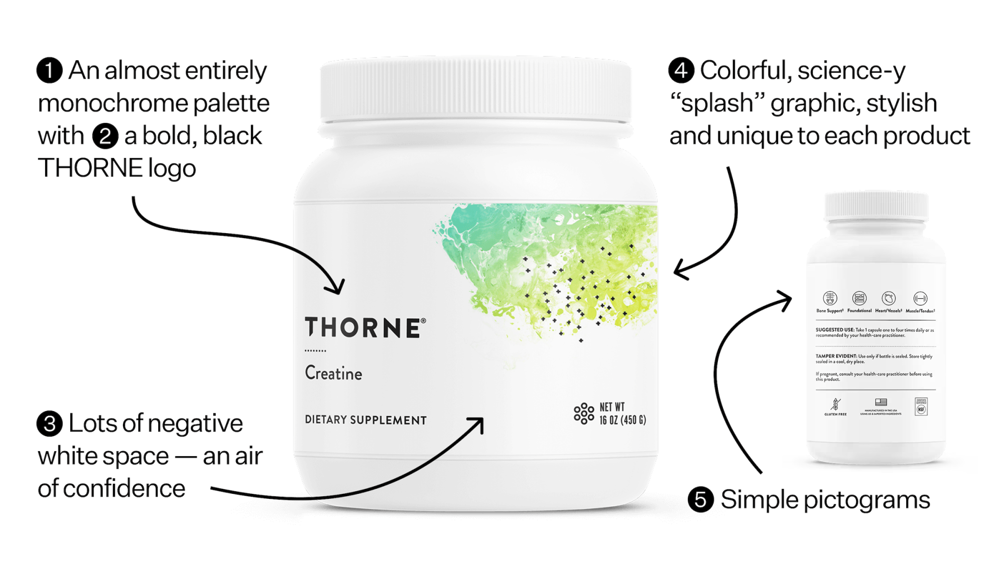
Five main things I’d highlight:
- Thorne’s mostly black-and-white color scheme, which gives it a foundation of institutional simplicity and cleanliness.
- A bold, black, all-caps THORNE logo in a customized version of Brandon Grotesque, a newish sans-serif font described as having a “functional look with a warm touch.”
- A large proportion of negative/white space, which gives Thorne an air of confidence. This draws from Thorne’s professional/direct-to-consumer background, where the packaging isn’t fighting for attention on a shelf. (This is unusual in retail — especially grocery — where most packages use every available square inch to list traits or otherwise try to stand out. Let’s see if P&G lets this fly for long.)
- A pop of color in the form of an illustration that it calls “the splash” — a design that’s unique to each product, based on its formulation, that looks like an attractive and sophisticated take on the random shape that you might find on the cover of a science textbook.
- Pictograms explaining the product, which feel approachable and more “modern CPG brand” than “sterile B2B medical brand.”
Thorne moved to the new look in 2018, and you can see the difference in these side-by-side photos, part of a blog post by Cheyenne Eggert, Thorne’s longtime senior design manager, about its brand evolution. The new packaging (right) looks much more premium and intentional — the old one (left) feels more like something random you’d find at a hippie nutritionist’s office.

If it seems like you’ve seen Thorne a lot more recently, you have. Founded more than 40 years ago, Thorne initially focused on selling high-quality supplements through an ecosystem of health professionals, including doctors, dietitians, nutritionists, trainers, etc.
The rest of this post is for paid members of The New Consumer.
Join for or .
Already a member? Sign in here.

Hi, I’m Dan Frommer and this is The New Consumer, where consumer operators, founders, and investors get the real read on what’s happening — original reporting, proprietary data, and sharp analysis you can take into your next meeting.
You’ll get my twice-weekly newsletter, read by leaders at Sweetgreen, David Protein, Forerunner, and L Catterton. Plus Consumer Trends, our research series cited by the Wall Street Journal, Axios, and WWD.
Not ready to join? Start with a free account.